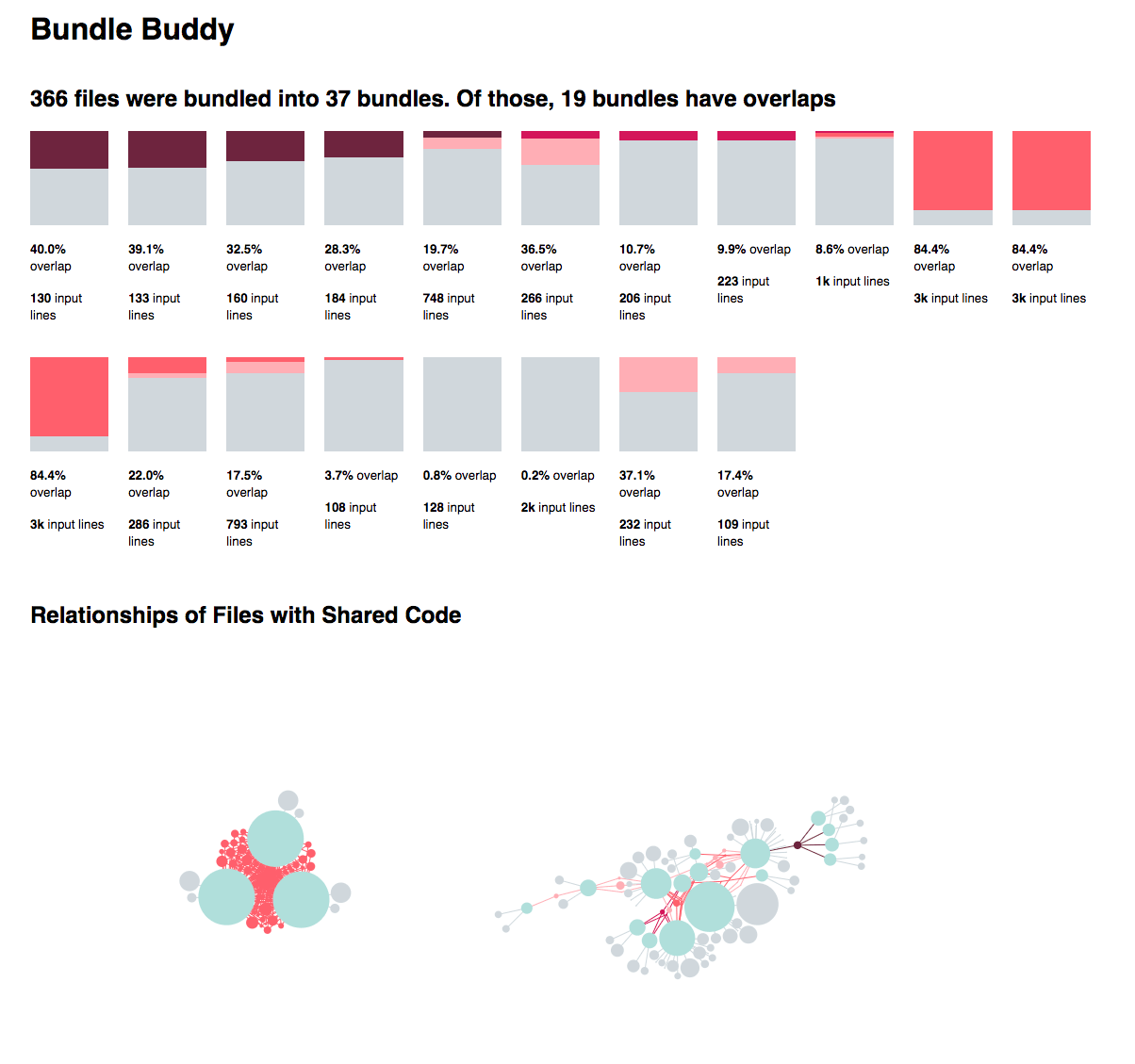
Bundle Buddy
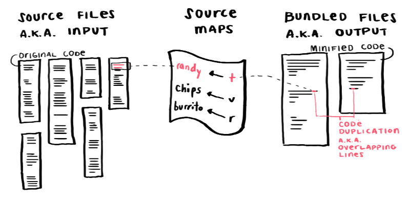
When building a complex JavaScript application, it is common to minify code and bundle files together to optimize network requests so the app loads faster.
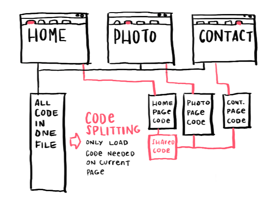
A common pattern for complex and large applications is code splitting. Typically this breaks up the bundles by each route in your application so users only download the code necessary for each page.
Code splitting however is a delicate balance between limiting the number of files a user must download, and the size of those files.
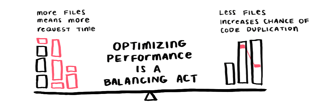
In complex applications, there are many dependencies which makes it difficult to identify this sweet spot. There are also several parameters to tune while code splitting, but it's difficult to see the impact of changing them.
To help with this balancing act, Sam and I made Bundle Buddy (demo) specifically to determine if your bundles are duplicating too much code at the cost of reducing the file count.
This article focuses on the design of the UI and the data visualizations in Bundle Buddy to identify code duplication.
Proof of Concept
The initial hypothesis: Do any of the bundles have code that overlaps with other bundles?
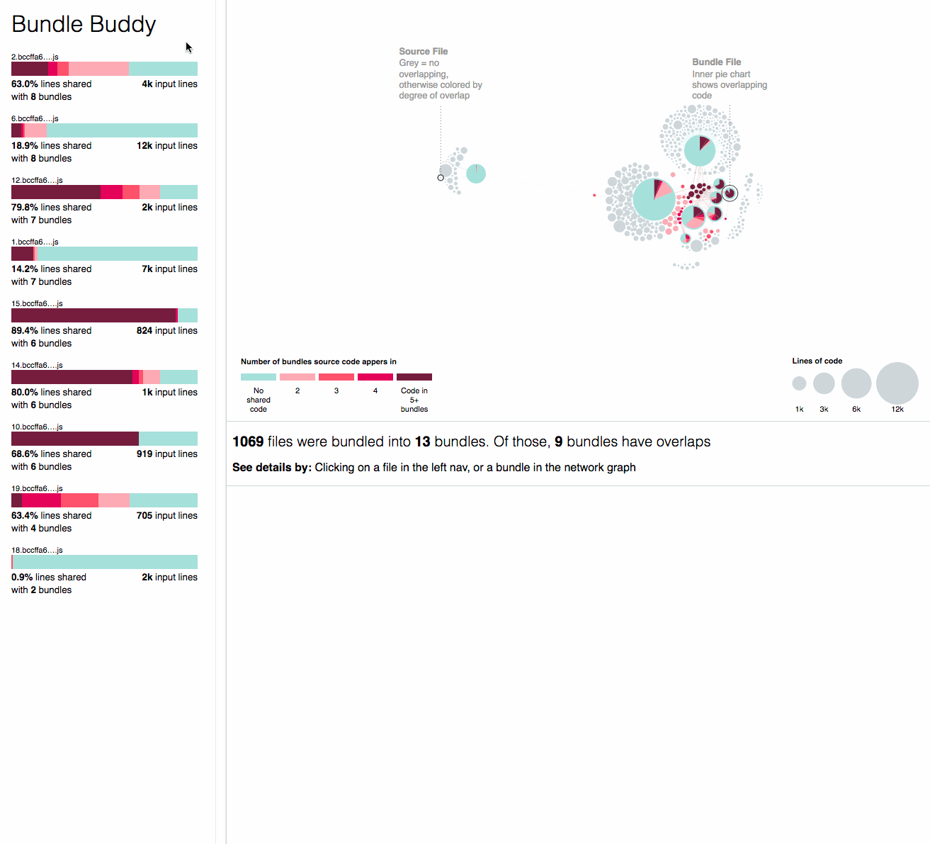
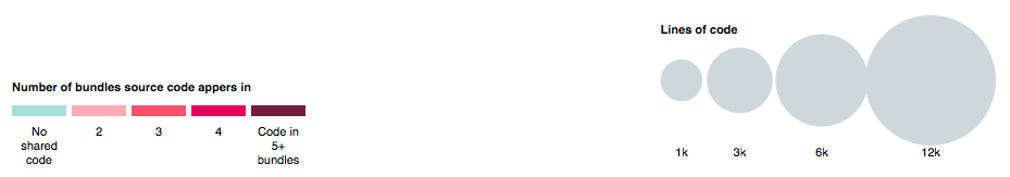
To start, we plotted the source files as a bar chart. The height is the number of lines of code and the color is the number of duplicate bundle files that code appears in.
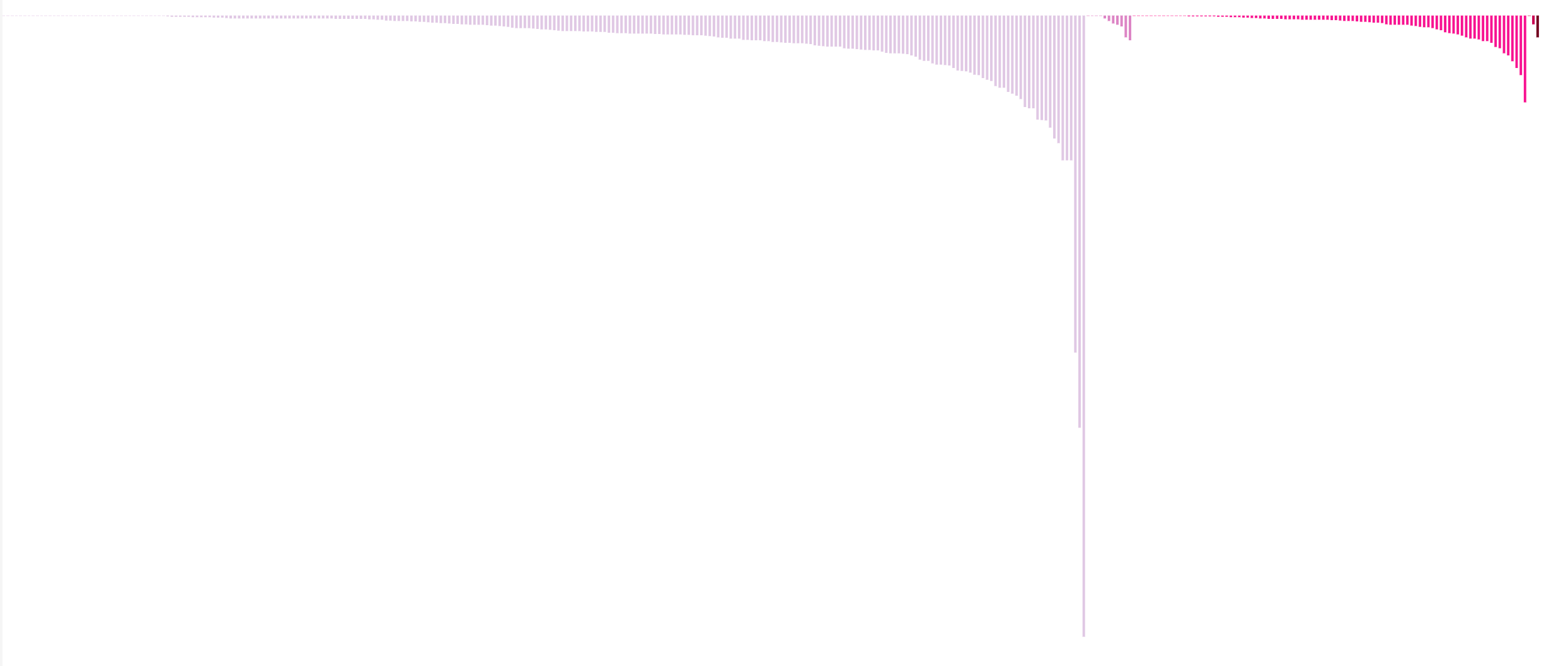
The largest group of light purple lines are input files that have no overlapping lines in the output files. The following groups in pink increase in darkness the more times that file appears in multiple bundled files.
Now that we know there are overlapping lines, we wanted to understand how are these source files related to the bundled files?
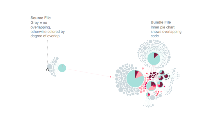
We turned the files and their overlapping lines into relationships for a network diagram.
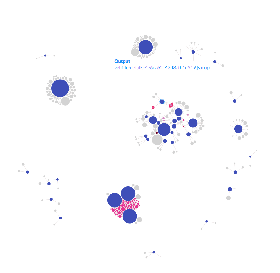
- Each circle is a file
- Blue circles are output files
- Grey circles are input files without overlaps
- Pink files are input files with overlaps
- Links mean code is going from the source file into the bundled file
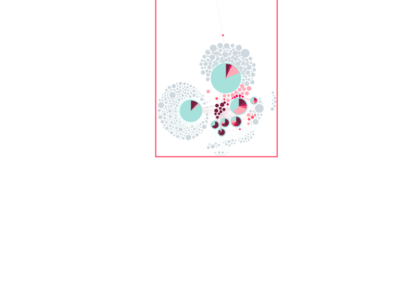
With the network view you can quickly see that there is one large group of interrelated input and output files that make up the share of highly redundant code. You can also see this cluster of three files that share many source files in common.
The network graph reveals useful patterns to help us understand the nature of the code duplication
App Iteration
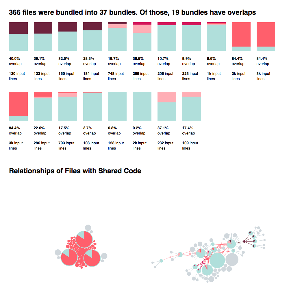
To start, we revised our bar chart of each source file by flipping the perspective to look at the percentage of overlapping lines going into each bundled file. We wanted to focus on bundles that don't have any overlapping code, so we combined the file view with the network view and filtered out files with no overlaps.
I thought it would be helpful to add a pie chart on top of each bundle file in the network. This would be the same information as the bundle bar charts with the benefit of:
- Helping users match the bundle bar chart with the corresponding bundle in the network
- Further differentiating the look of the bundled files in the network with the source files in the network
Creating a user workflow
At this point, we brainstormed the workflow we wanted the app to support:
- Find all of the bundled files that have overlapping code. Show them in the order of most overlaps.
- Zoom into one bundle to find the source files the overlapping lines are coming from and the bundles that share those overlapping lines.
- Open up a source file to see the overlapping code
Then we sketched out a new layout that incorporated these visualizations and supported the steps in the workflow.
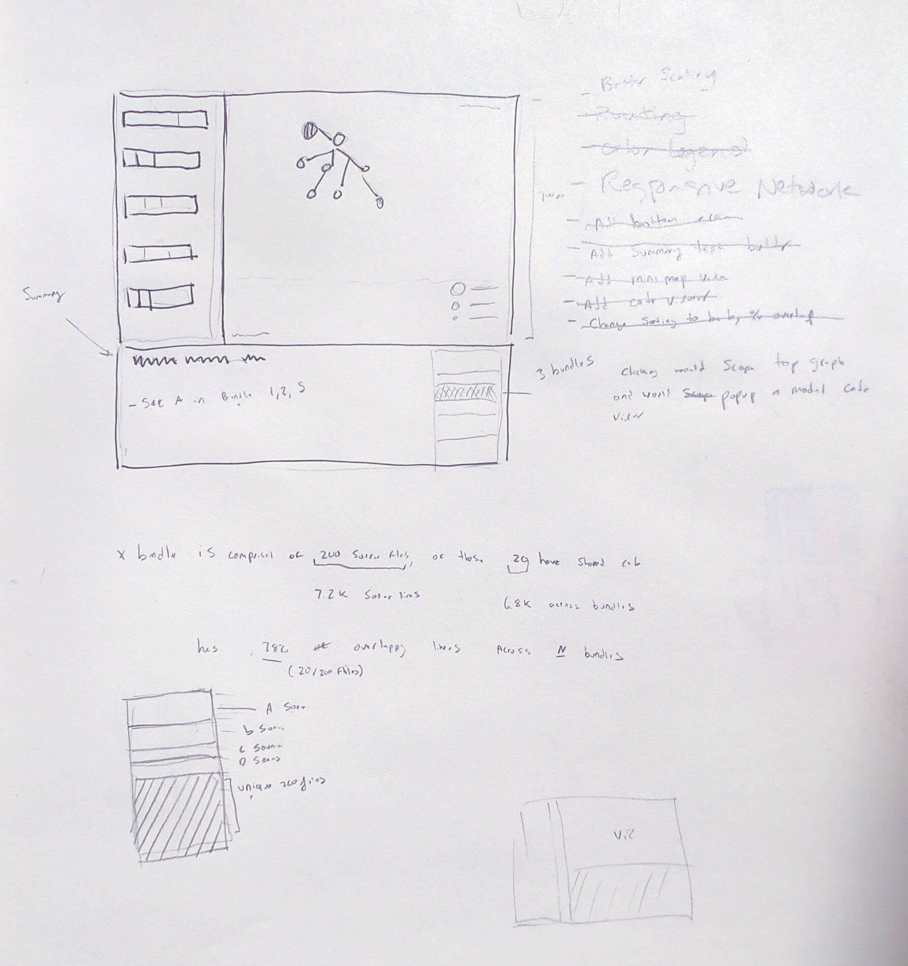
Sam's mockup sketch
Initial Bundle Summary
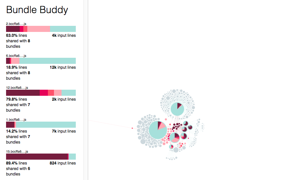
Let's start with the design changes inspired by the mockup of the left panel:
- Invert the files from being vertical bars to horizontal bars
- Add the file name
- Refine the summary sentences below each file
- Sort the bundles first by number of other bundles it had overlapping lines with, then by number of overlapping lines
On the right panel the network shows all of the bundled files that have overlaps, and their related source files.
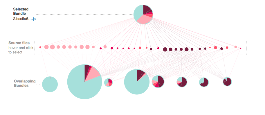
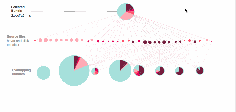
Selecting a bundle
You can click to highlight a bundle and it will zoom into only source files that went into the selected bundle, and the other bundles that share that source file's overlapping code.
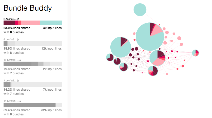
As we played with this version, I realized two problems with the network graph. It was difficult to find the selected bundle and difficult to understand the relationships between the input files and the output files.
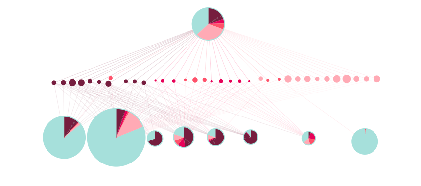
I decided to create a more diagrammatic view of the files laid out into three rows.
- First row: the selected bundle
- Second row: all of the source files
- Third row: all of the related bundled
I made this graph using the d3-force module which made it trivial to add two more forces into the layout and generate the hierarchy I wanted.
When you work with the force algorithms, you don't know where everything will be placed in the end. Since each user is uploading their own app, I needed to auto-position the network to guarantee it would always be in view.
Placement: Use the bounding box of all of the nodes to translate the network to the top of the bounding box, and center it.
Rotation: Knowing the network pane is oriented horizontally, use the bounding box to determine if the network graph is also horizontal or vertical, if it's vertical reverse the x and y positions to make it horizontal
A whole section of the network graph had been hidden from view, now it is visible:
The next step in making this view usable was adding in context. I used d3-annotation to add in two types of annotations.
Informational: Help users understand how to read and use the network graph
Contextual: Hover behavior as you mouseover the network graph
Legends: Size and color legends using d3-legend for readability
Selecting a source file
Now that we had basic functionality for the first two steps of the workflow, we wanted to enable users to see the source code.
In the bottom pane, we created a bundle breakdown by source file, and a source code viewer. We added a gutter that shows the count and matching color of shared bundle files for each line.
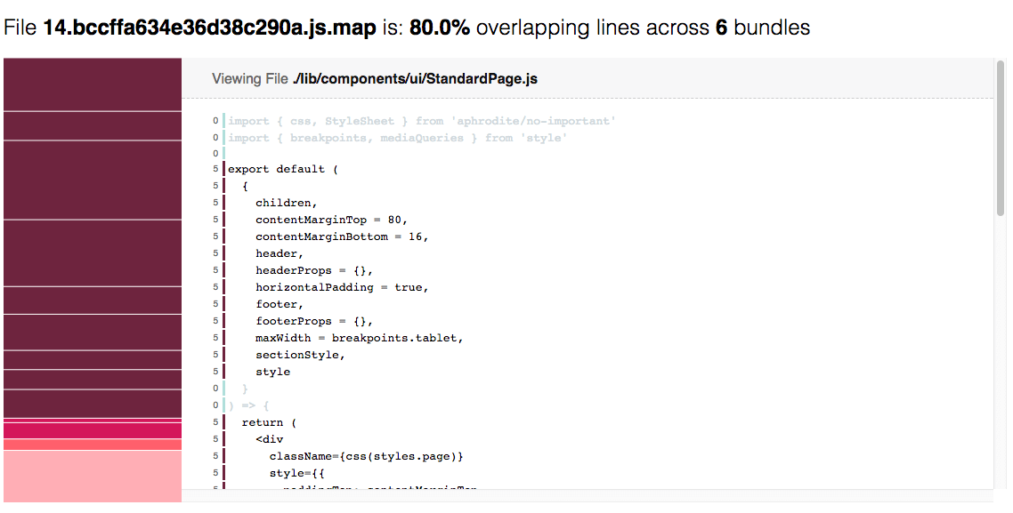
Immediately it was clear that on larger projects we would need a better interface for selecting the source file, we added:
- On click on the network graph to select a source file
- Fisheye distortion to the bundle breakdown so you could select skinny bars
- Annotations to the top files in the bundle breakdown and the selected source file
- Resized the files, instead of height being the total lines, it was the total lines x the number of overlapping bundles
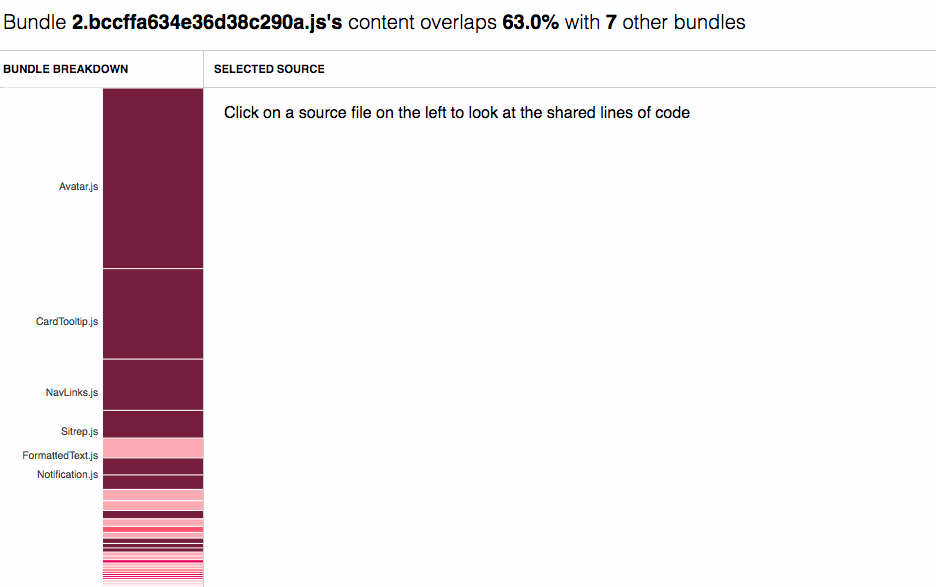
We also added a summary above the source code of the related bundle files. This is especially helpful when related bundles have different sets of overlapping lines:
Final App
I enjoyed bringing together all of these visualization techniques to show the complex relationship of files before and after bundling. All credit for this project idea goes to Sam who wrote the code for parsing the source maps and generating the data needed for the application, and thanks Paul for hacking with us on the code viewer.
All together here is a gif of the entire workflow.