Emmys 2017
The inspiration for this makeover was an email sent out by our Chief Content Officer, Ted Sarandos, congratulating our Emmy nominations for 2017.
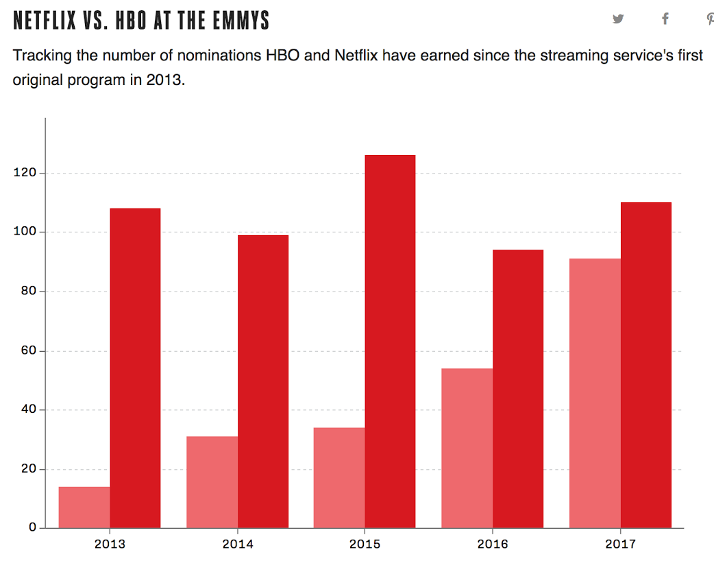
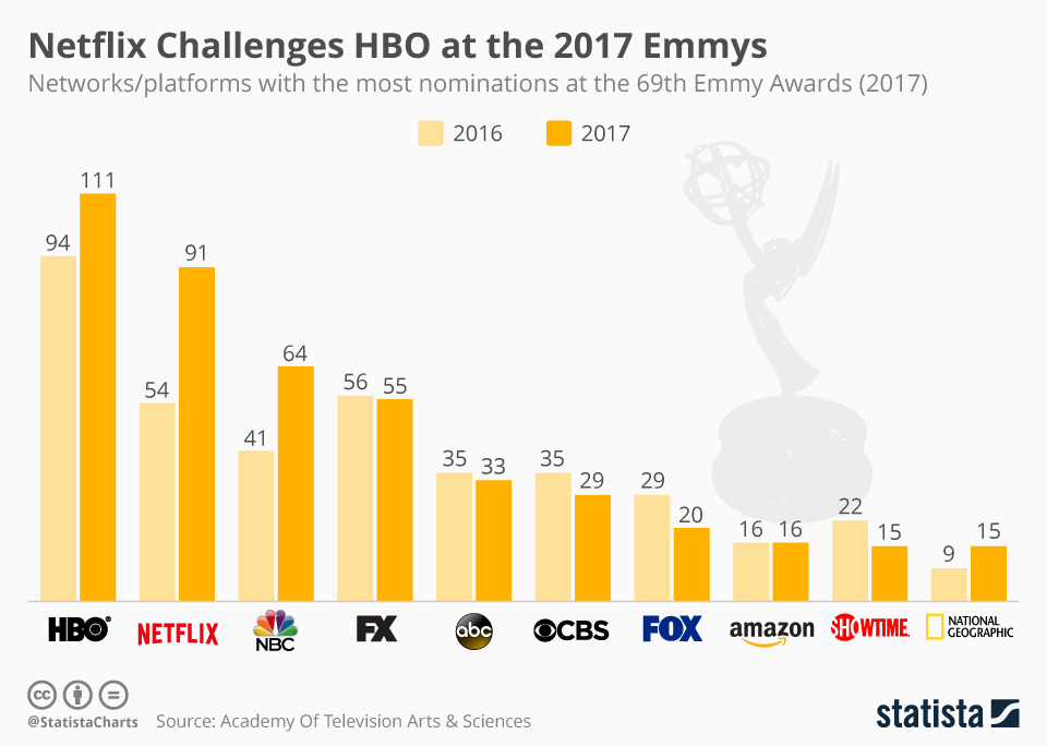
These are the original charts from the email by the Verge and Statista:
For the makeover, I started by summarizing the goals of these two charts:
- Compare Emmy nominations for HBO vs Netflix
- Provide nominations from other networks as context
I decided to combine these goals into one line chart showing the change in nominations over time.
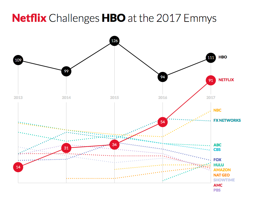
I wanted to keep the comparison of Netflix and HBO as the main story since it was the headline in the original charts. To emphasize them, I made all of the other networks into dotted lines, and added circles with numerical callouts for each year just for Netflix and HBO.
I turned it into a line chart because the connections between each year gives the user another graphical element to visually scan for increases and decreases in nominations. It also makes it easier to follow one network over time.
The final change was minimizing the axes as much as possible. Originally the labels were on the bottom and they interfered with the line labels in the redesign. I moved them to an emptier part of the chart to prevent overlapping and improve legibility.