Storytelling in Dashboards
Reframing the analogy
A common categorization for data visualizations is exploratory and explanatory.
When you're in explanatory mode, you already know the outcome and you can present the key points to your audience in a clear and delightful way. Here are some successful examples of explanatory data visualization commonly considered data visualization storytelling:
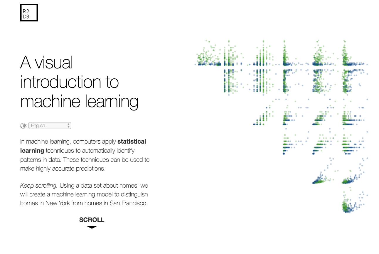
R2 D3
By: Tony Chu and Steph Yee
The Story:
You too can learn machine learning
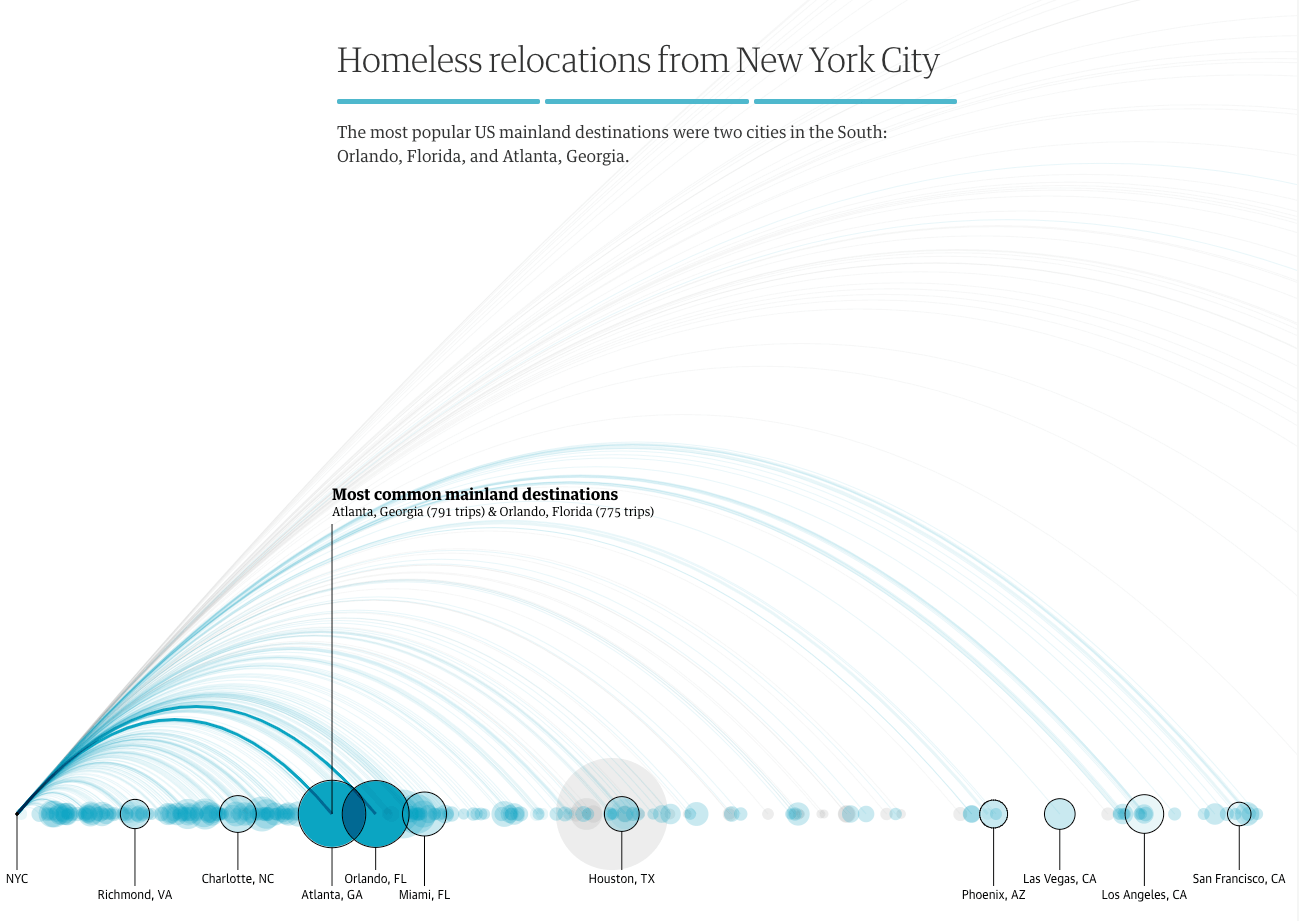
Bussed out
Data Visualization by: Shirley Wu and Nadieh Bremer
The Story:
The impact of moving homeless people to other states
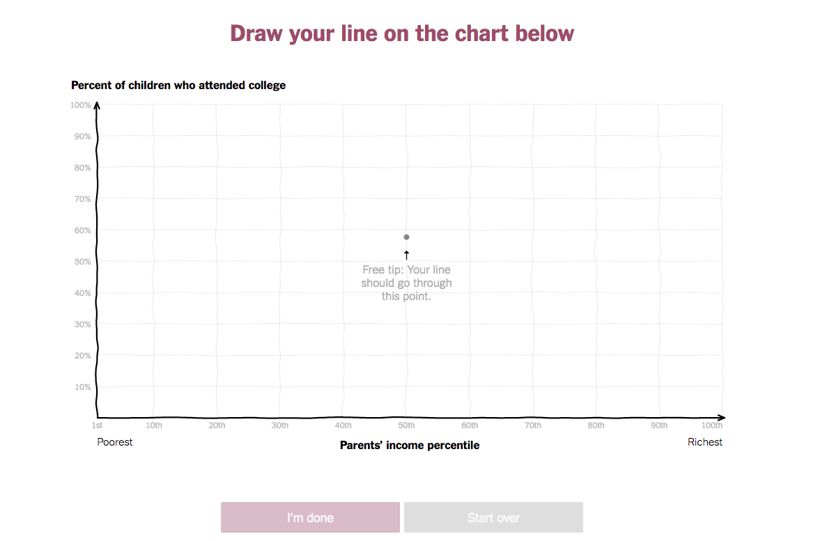
You draw it
How family income predicts children's college chances
By: Gregor Aisch, Amanda Cox, Kevin Quealy
The Story:
You are probably wrong along with everyone else about this data
In exploratory mode you want to make it as easy as possible for people to examine the data and come up with their own conclusions. In my current work this is the primary type of data visualization project and it usually comes in the form of an interactive dashboard.
Commonly we reduce these two modes into:
Explanatory = has a story e.g. scrollytelling
Exploratory = doesn't have a story e.g. dashboards
I want to reframe this analogy. When done well, exploratory data visualizations do have a story. It's a choose your own adventure story, a branching narrative.
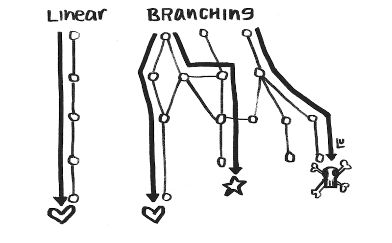
Part I
Why does framing exploratory viz as a form of storytelling matter?
In explanatory scrollytelling you see much more success in using storytelling devices such as setting the scene, introducing concepts bit by bit, providing strong contrast, and directing the narrative to a climax in the story. While directing the narrative is difficult in an exploratory mode, we can still learn from the other aspects of telling a story to design dashboards more effectively.
As an example, let’s dig into setting the scene in more detail. Setting the scene with context allows your audience to interpret the data with the right perspective. You could be looking at the same data, in one story the context sets a bleak situation. A small drop in metrics is highly contested and investigated.
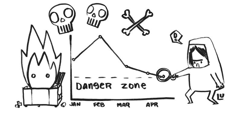
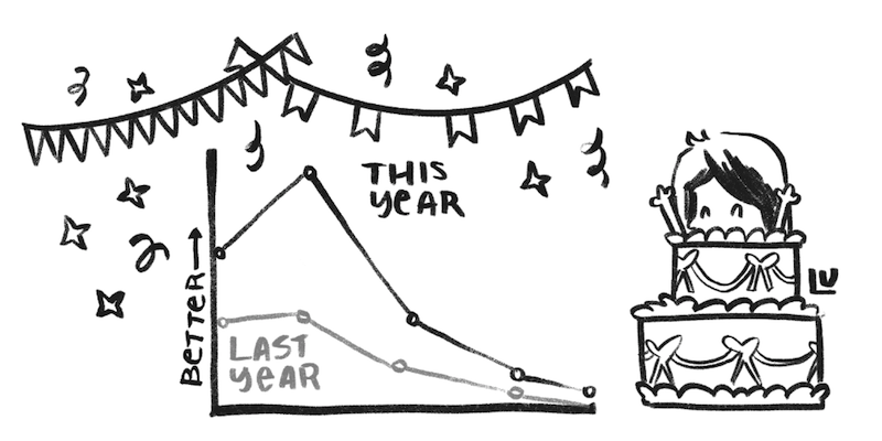
In a different scene the same metrics could be compared to the previous year to reveal a huge success, a cause for celebration.
Why is setting the scene more difficult in exploratory dashboards?
Explanatory scrollytelling
Has a static dataset.You know the distribution of the data, and its outliers. Making color scales for your data a one-time decision.
You can manually place annotations based on the final layout of your visualizations
You have a one-time general audience.
Exploratory dashboards
Has a dynamic dataset.Setting color thresholds is difficult, you may base it off today's value but as data changes over time, those thresholds may no longer make sense.
Annotations move over time, as more data appears. They also may change in status and become irrelevant.
Your audience visits multiple times. On-boarding first-timers without hindering expert users becomes a balancing act.
All of these factors make it too easy to avoid much needed context.
I would like to see dashboards push the boundaries of storytelling in rich delightful ways like you see in successful scrollytelling pieces. Specifically I think dashboards could show a stronger use of contrast, more creative ways of exploring what-if scenarios, and more tailored designs for delivering multiple branches of the story to the user ( ...or maybe all we really need is some sticker packs for our charts).
Part II
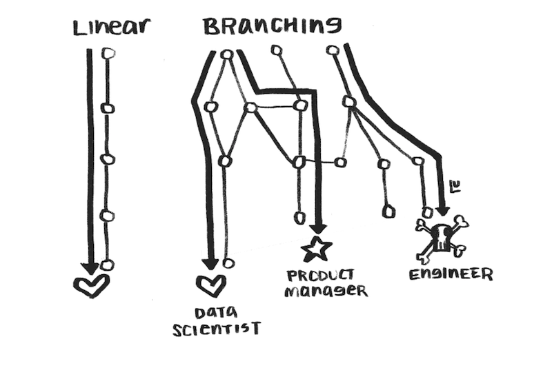
Why are dashboards more suited for branching narrative?
Scrollytelling is optimized for a single visit by a general audience member, while dashboards are optimized for multiple visits by many types of users. This affords two ways of approaching narrative.
Branch the narrative based on the type of goal you have in mind. Different users will be interested in different types of insights.
Even if you don't know what the data will show over time, you can optimize the type of visualization, color choices, style, and annotations to design for specific goals.
Here are some example user types and goals that we branch for in our dashboards:
The product manager
What is the state of people using different devices to watch Netflix?
It looks like iPad usage is surprisingly small compared to Android tablets. I can find an opportunity to make the experience better on iPad.
The data scientist
Has the new variable I've introduced into our algorithm changed engagement?
The new variable showed 50% more interaction with titles from audiences than previous titles we were showing.
The engineer
Is anything broken?
I found a spike in visits on a page that should be receiving minimal traffic. I need to investigate.
The second type of branching results from dynamic data in dashboards. Framing dashboards as storytelling allows you to turn this into an opportunity to change the narrative depending on the data instead of using the same chart type and annotations on a visualization that is no longer the best suited design.
Branch the narrative based on the type of data you have. Optimize your visualizations for different data scenarios.
I recently built a dashboard with movie titles. Some titles were released before the time range of the dataset I was working with, so I did not have data on their release metrics.
Conditions
If the release date was months before the dataset startedBranching Visualization
One timeline for all of the data that is available, providing context that some of the data was missing, and highlighting outliers.If the launch date was in the dataset
One timeline over ninety days after its released, annotating the largest value, and context on two time axes: days since launch and calendar date.
If the title had multiple seasons
Two charts, one as a timeline showing the progression of the title as more and more seasons were added, and one with an axis of days since launch so you could compare release performance across all seasons.
The final part of thinking about dashboard design as a branching narrative examines what this framing allows us to learn from.
Part III
How do I design storytelling in dashboards effectively?
With dashboards, you want to make the user so delighted with their experience that they come back whenever they need to answer a question with your data.
You must design for users across multiple skill-levels with your application, and provide ways for users to level-up from a beginner mode.
The perspective of thinking of dashboards as a choose your own adventure story allows us to not only lean on devices from novels but also game design. This analogy gives a mental model for us to look at how we can improve our work on dashboards.
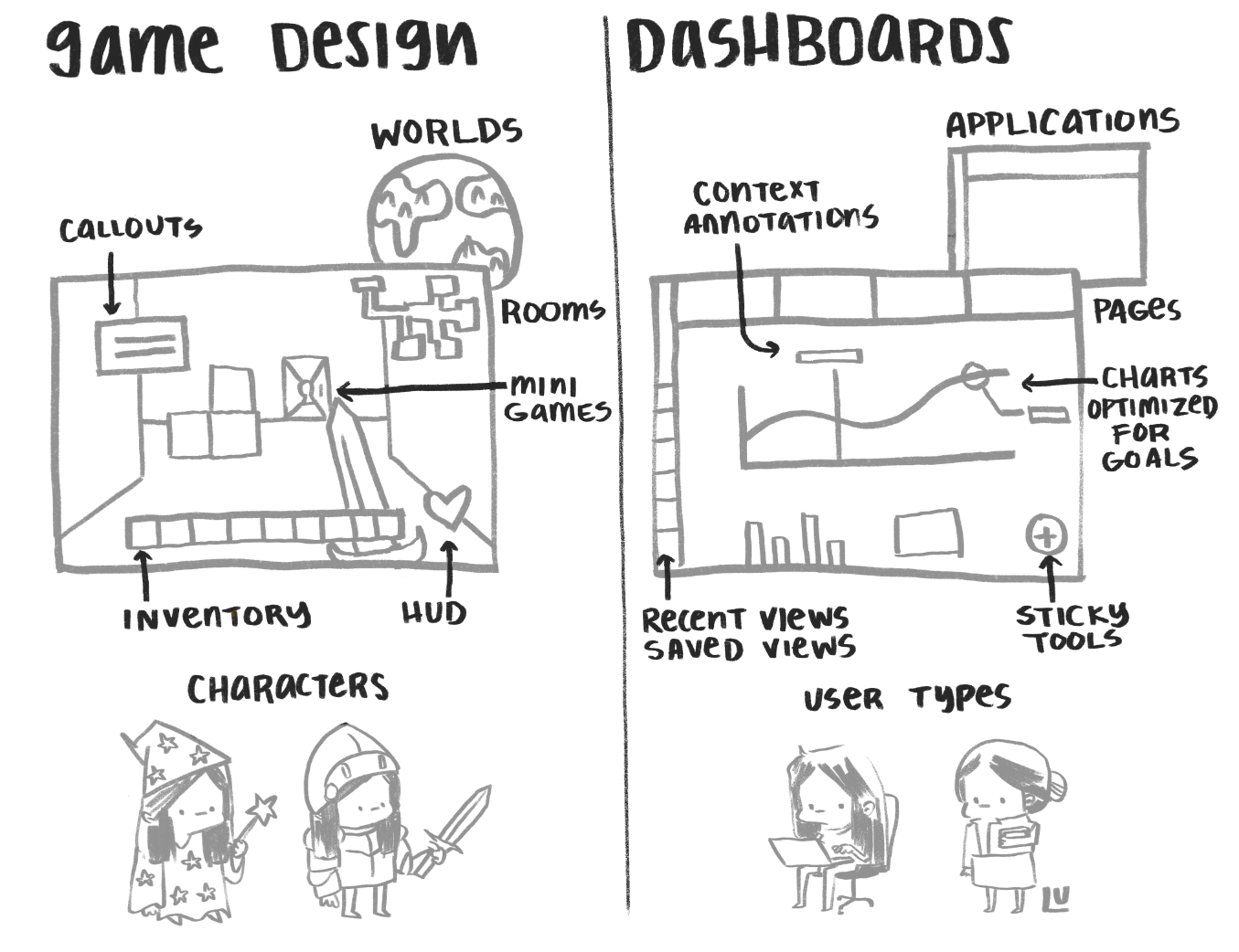
Here are two ways employing this mental model can help with the design of dashboards:
Design for multiple visits / Quickly recognized features
From a game design perspective this applies to clearly marking what your user can interact with. In recent dashboards I've tried to be more deliberate with my use of color by only using color to signal items that have interaction states.
You can also pull in the concept from game design of using a Heads Up Display (HUD). These are items that stay in your player's view and provide additional information on the state of the game. A representation of that is using a sticky nav or sticky context in your dashboard to be thoughtful about what tools a user will need in different parts of your application.
Make it easy for users to save / Collecting items in your inventory
In books you collect clues as you learn about the plot and the characters, in games you have items and an inventory. In exploratory data visualizations your users are finding items all the time:
- You picked up an anomaly view
- You found a bug in the data
- You found an insight into how to make the product better
Make it easy for users to save the state of their application, share views into their data, and to change the type of item in their inventory as it evolves.

A Preface
This is just the beginning of a series of posts on designing for storytelling in dashboards. I would love to hear from you on more creative ways to push the boundaries of data visualization with this framing.